TigerData: Redesigning Service Overview
Simplifying the interface to reduce clutter and clearly guide users through database setup.
Product Design

Project Overview
Client: TigerData
Industry: Software Development (Developer Tools, Cloud Data Infrastructure)
Timeline: 12 weeks (2025)
My Role: Sr Product Designer
Tiger Cloud provides cloud-based database infrastructure and management tools, helping teams deploy, monitor, and scale their databases with ease. The Service Overview page in the console, however, was overdue for a refresh—low engagement and a cluttered interface made it hard for users to figure out where they should focus their efforts. I redesigned the page to reduce visual noise, clarify hierarchy, and guide users toward the essential steps needed to get their databases up and running.
The problem
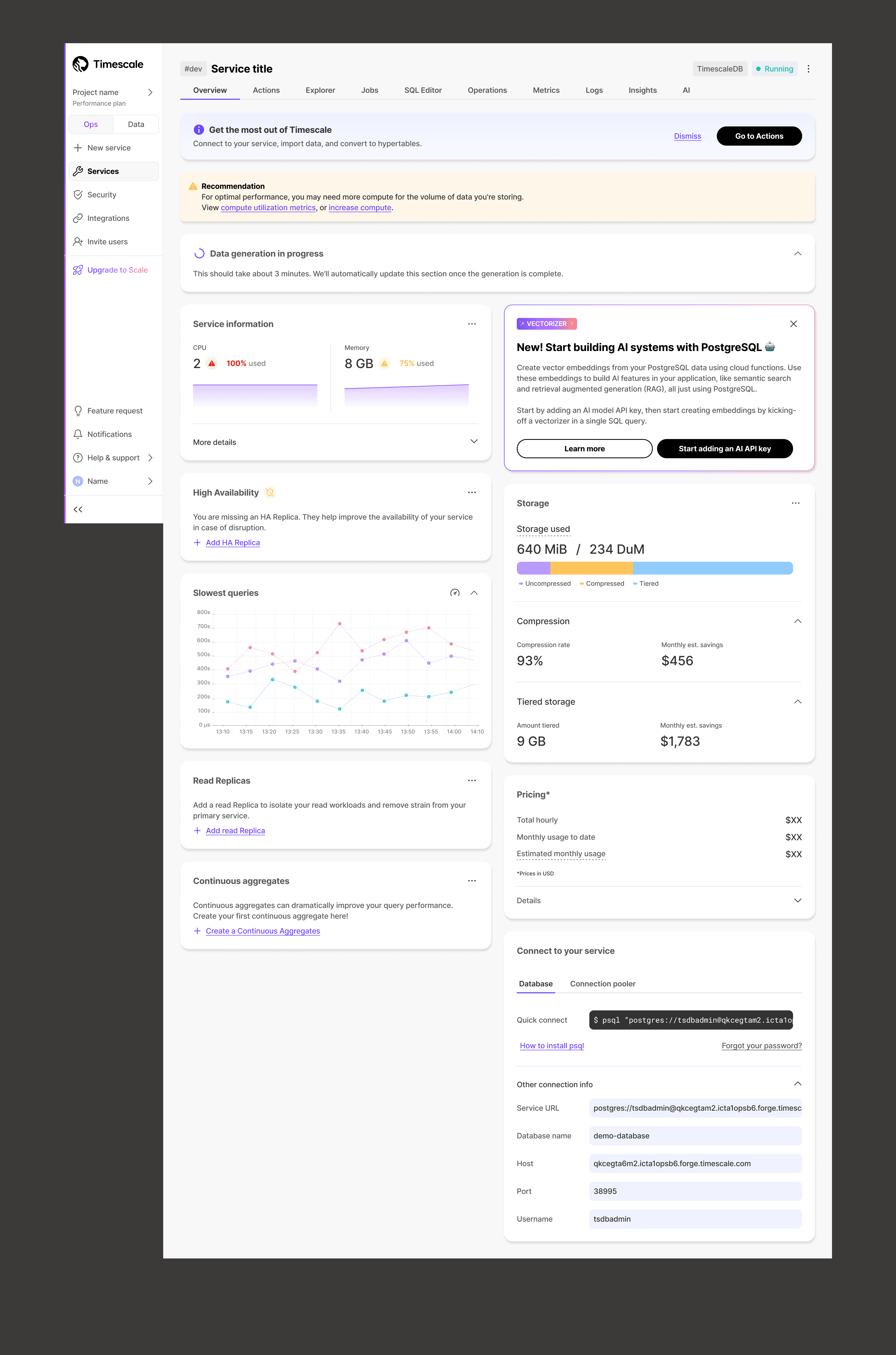
The Service Overview page in the console suffered from lower engagement and cluttered banners. Users often struggled to focus on key actions, especially when multiple notifications or CTAs were present.
Below is an example of the page before this project. While cases with multiple banners were rare, they were possible, so we needed a solution to handle them. Even in pages without banners and numerous CTAs, it was still difficult for users to know where to focus and what steps to take next.
My Role
I led the redesign of the Service Overview page, collaborating with other designers and engineers to explore patterns that could handle both simple and complex service states. My responsibilities included:
Researching existing platform patterns for guiding users through empty or partially configured states
Designing solutions that reduced visual clutter while keeping important messages visible
Collaborating with the team to ensure the new layouts were technically feasible and scalable across multiple services
Solution
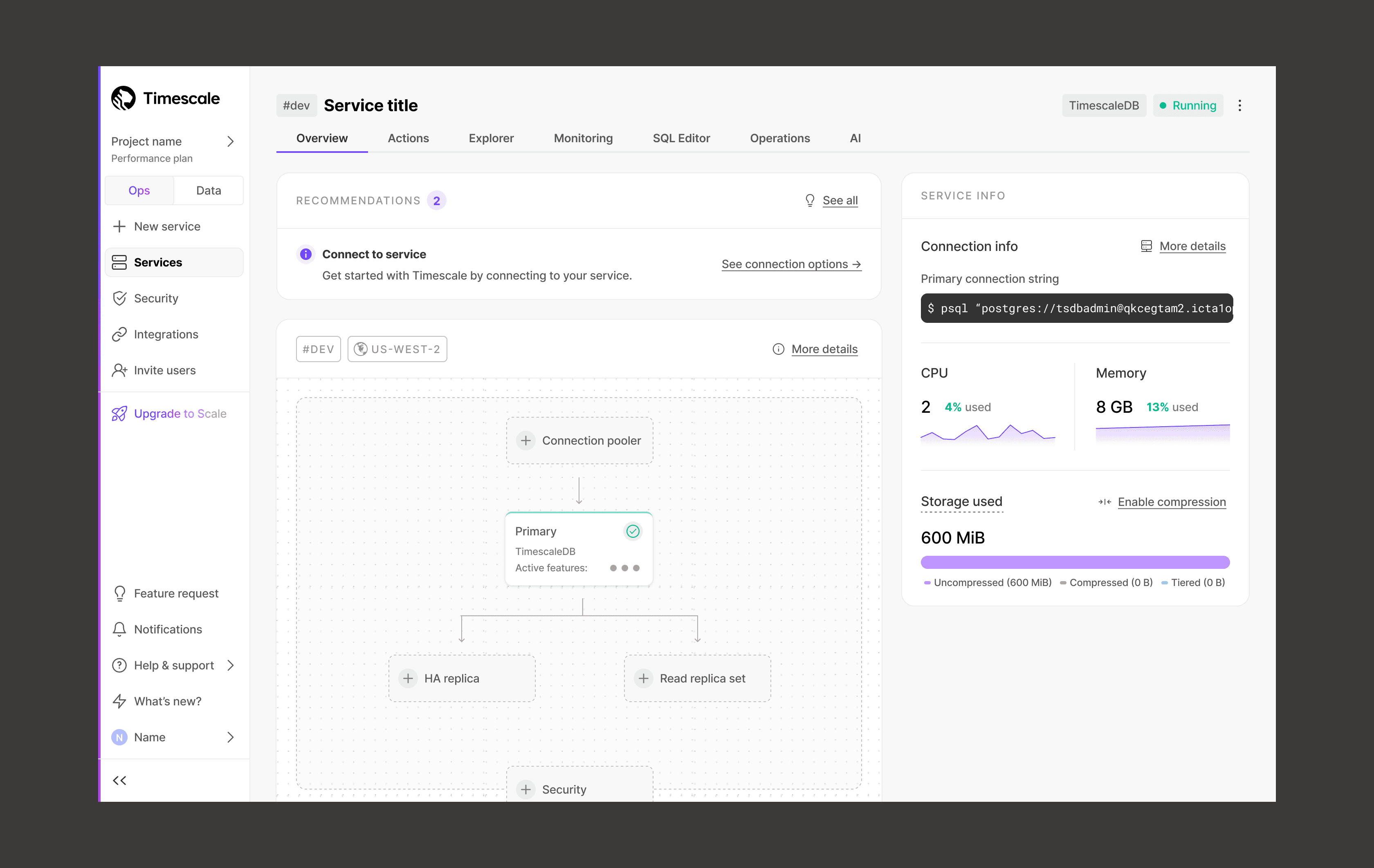
To improve clarity and reduce noise, I drew inspiration from map-based concepts where empty states suggest the next steps without relying on banners. The team also introduced a consolidated recommendations system, displayed in the top-left card, which surfaces key messages without overwhelming the user.
The result is a cleaner interface that:
Highlights next steps clearly for the user
Reduces clutter from banners and excessive buttons
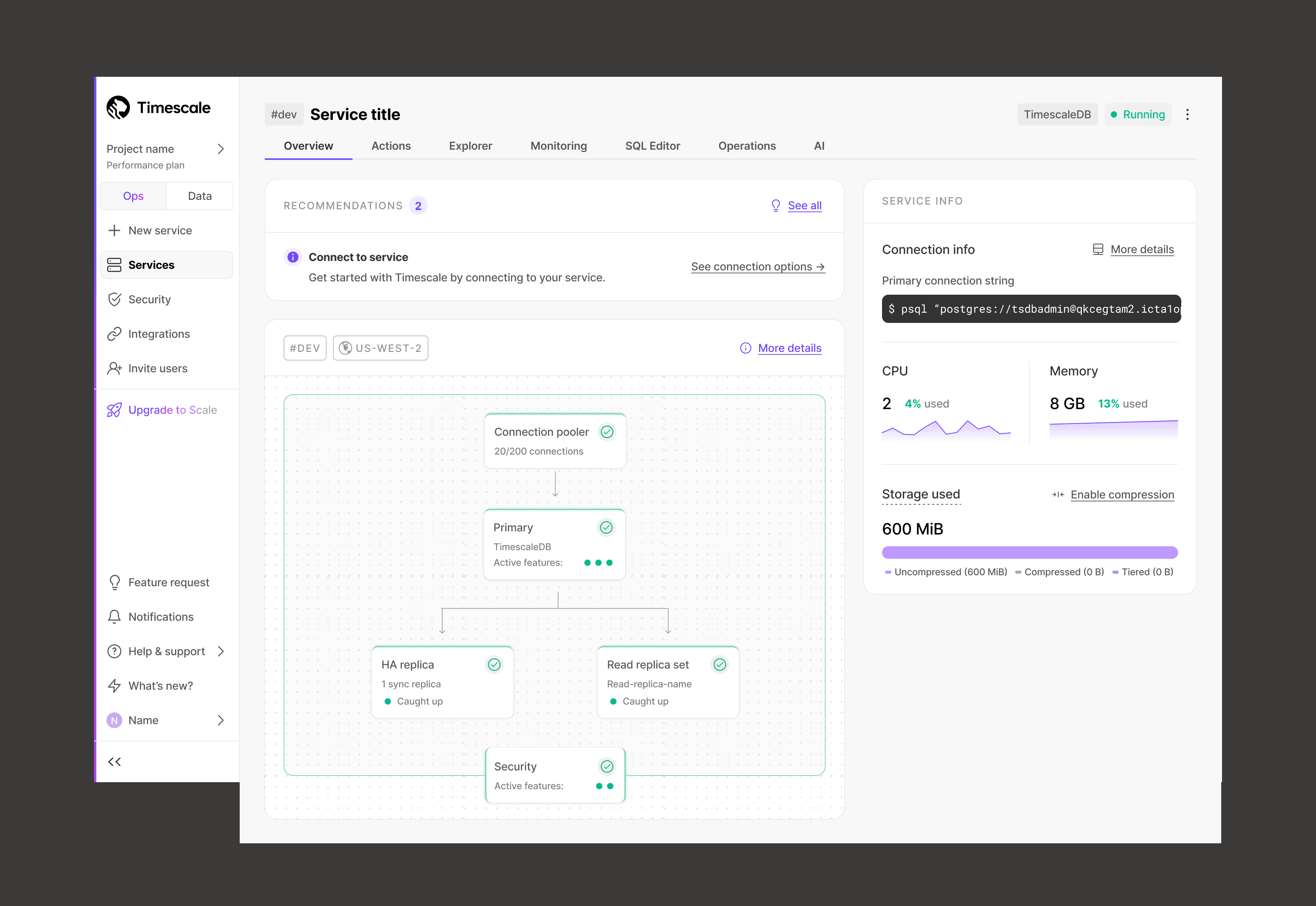
Scales to handle both new services and fully configured services
An example of a brand new service with empty states:
An example of a service with everything configured:
Lastly, here is a demo of how easily users can get to and from important flows from the overview page:
Impact
The reception has been positive overall. We saw increased engagement with our recommendations, as tracked internally via Slack, along with positive feedback from users on the redesign. We're continuing to monitor the feature to identify opportunities for future improvement.